But New Changes to the Gmail Interface clearly miss the mark
Gmail has added some new interface elements, namely a contextual drop-down menu as part of every message.
(click image for the bigger Flickr photo):
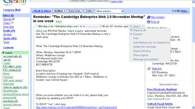
This menu could have been added for many reasons -- maybe to reduce screen clutter, or to highlight key features of the mail service.
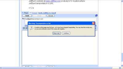
But the end result is unmistakable -- Gmail is becoming just like every other web-based email service before it (eg: Yahoo! Mail). With the same errors (see the image below). The same clunky interface (how is user supposed to know what that down arrow means at the top-left of a message... or that it's clickable... or that there's even a menu there?).
(click image for the bigger Flickr photo):
What does it mean when the apps that defined innovation and simplicity become themselves complex and broken because of a poor attempt to appeal to a broad audience?
I know Google and the Gmail team are talent folks and do a lot of testing -- and that the kinks with these rounds of interface tweaks may (and probably will) iron themselves out. But bottom line: I expect a lot from a company like Google and it's designers. These "5 new features" that Gmail now totes atop every page -- they're so far off the mark in terms of clear, clean ease-of-use, and the true value of what a mail app should be.

 Subscribe to Annoying Design's Feed
No comments:
Post a Comment